


 Share on media
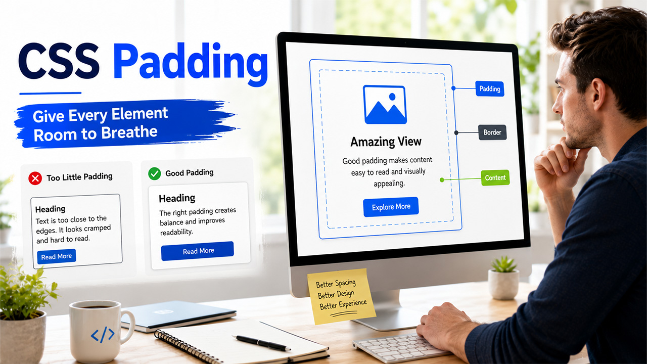


If you’ve ever looked at a webpage where the text feels cramped right up against its edges, chances are the fix was missing CSS padding. It’s one of the most basic properties in CSS, and also one of the easiest to overlook, until a layout looks just slightly off and you can’t quite figure out why.
In simple terms, padding refers to the spacing between the content of the web element and its borders. When done correctly, it will give your webpage a nice, comfortable feel to it, and when not done right, it will make your otherwise well-designed website look cluttered.
In this blog, we’ll break down exactly what padding does, how it’s different from margin and border, the syntax you’ll actually use, and a few common mistakes worth avoiding.
What Is CSS padding?
CSS padding is the space inside an element, between its actual content and the edge of its border. Think of it like the cushioning inside a box: the content sits in the middle, and padding is what keeps it from touching the walls.
All HTML elements have space that can be changed with CSS. Without any padding, an element’s content connects straight to its border line. This makes it look crowded and unprofessional, especially when styling buttons and cards, where extra space is important.
Padding also affects the size of an element. As you add padding to the box, the element will expand to include the extra space in its size, unless you use box-sizing: border-box. This keeps the total size the same and takes away the padding space from inside the element.
Padding vs Margin vs Border: What’s the Difference?
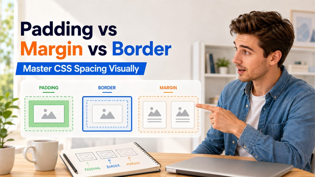
All three of these CSS properties get confused quite often, mainly due to the fact that they relate to spacing, but in completely different areas.
Padding :
The space inside an element, between its contents and border. It is part of the element itself.
Border :
The visible or invisible outline that surrounds both the padding and the content. It is located outside the padding.
Margin :
The space outside the border, which is used to separate an element from another element. It is responsible for spacing between elements, not within elements.
In simpler terms, the easiest way to imagine this is the following example: Imagine a photo on your wall. The photo is the content, the matte around it is the padding, the frame is the border, and the space between the frame and the next photo is the margin.
It is essential to know about this difference, as confusing these two concepts is the cause of many layout problems.
CSS Padding Syntax and Values
Padding is flexible once you know the shorthand, and it saves a lot of repetitive code once it clicks.
The most basic way to set padding on all four sides at once:
padding: 20px;
If you want different values for each side individually:
padding-top: 10px;
padding-right: 15px;
padding-bottom: 10px;
padding-left: 15px;
Or use the shorthand version, which follows a clockwise order, top, right, bottom, left:
padding: 10px 15px 10px 15px;
A couple of shortcuts worth knowing:
Two values: padding: 10px 20px; sets top/bottom to 10px and left/right to 20px.
Percentage values: padding: 5%; sets padding relative to the width of the parent element, useful for responsive layouts.
Different units: Padding accepts px, em, rem, and % depending on how you want it to scale.
Getting comfortable with this shorthand is genuinely one of the fastest ways to speed up writing CSS day to day.
How to Use Padding in CSS
Seeing padding in action makes the concept click faster than reading definitions alone.
A simple button with breathing room:
.button{
padding: 12px 24px;
background-color: #2c3e50;
color: white;
border-radius: 6px;
}
Without the padding, the text of the button would stick to the button borders, appearing not clickable and squeezed. Those 12px on the top and bottom sides and 24px on the left and right sides give it weight visually.
A card layout with consistent inner spacing:
.card {
padding: 20px;
border: 1px solid #ddd;
border-radius: 8px;
}
This keeps any content inside text, images, headings, from touching the card’s border directly, which is what makes card-based designs feel clean rather than cluttered.
For those who work directly within the WordPress site, applying padding requires changes in the CSS of your theme or using the Additional CSS field in WordPress Customizer. For those who want to dig a little deeper, knowing how to edit WordPress HTML alongside your CSS gives you much more precise control over spacing than relying on theme defaults alone.
Common Mistakes with Padding
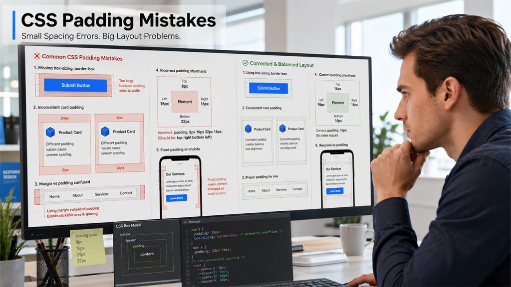
There are some recurring errors one tends to make once he/she starts using padding frequently:
Not using box-sizing:
When working with CSS Padding, the box-sizing: border-box property ensures the padding is included within the element’s defined dimensions, preventing unexpected increases in its overall width and height. Without it, adding padding expands the element beyond its specified size.
Using margin instead of padding and vice versa:
The confusion between margin and padding is probably one of the most frequent CSS errors, applicable to those who are learning CSS.
Inconsistent spacing across similar elements:
Buttons, cards, or sections with slightly different padding values make a design feel unpolished, even if no one can immediately say why.
Incorrect order of padding in shorthand:
The order of the values in padding shorthand is strictly defined: top-right-bottom-left. One mistake and padding will be applied incorrectly.
Fixed padding on responsive screens:
If the padding is fixed, then it may appear too big or too small on responsive screens.
None of these errors is difficult to avoid once one learns about them.
Conclusion
At the end of the day, CSS padding is one of those properties that seems simple on the surface but genuinely shapes how a design feels. Too little, and things feel cramped. A little too much, and spacing starts working against you instead of for you. Getting comfortable with it is really about practice and paying attention to how spacing affects readability.
In case you’re still learning CSS basics such as this, visiting a couple of best coding practice websites is definitely going to help you out. However, there is no substitute for hands-on experience in seeing how your padding, margin, and border interact when used.
Padding is definitely not a make-or-break thing when designing your website. Still, mastering it is one of those little but essential steps to creating a professional appearance.
Frequently Asked Questions :
What is CSS padding used for?
Padding creates space between an element’s content and its border, preventing text or images from touching the edges directly. It’s what gives buttons, cards, and containers a cleaner, more readable appearance instead of feeling cramped or cluttered.
What’s the difference between padding and margin?
Padding is the space within an element, between its content and its border. Margin is the space outside an element, between one element and another. Padding deals with the interior space of an element, while margin deals with the space outside of one element.
Can padding have a negative value?
No, padding cannot be a negative value in CSS. If you want your content to move towards an edge, then margin is the CSS property that should be used. Negative values are allowed for margin.
What does box-sizing: border-box do?
It makes padding work in such a way that instead of padding increasing the total size of the element by adding up to the width and height, the padding takes up space from inside the dimensions set initially for the element.
Is percentage padding based on width or height?
Percentage padding is always taken as a percentage of the width of the parent container, irrespective of whether it’s the top or bottom padding.